|
MAIN PAGE
> Back to contents
Litera
Reference:
Tsygankova A.A.
Graphic and visual means of creating an individual author's style (based on the texts of Umberto Eco)
// Litera.
2023. № 9.
P. 9-19.
DOI: 10.25136/2409-8698.2023.9.43941 EDN: WARBYV URL: https://en.nbpublish.com/library_read_article.php?id=43941
Graphic and visual means of creating an individual author's style (based on the texts of Umberto Eco)
Tsygankova Alisa Andreevna
Postgraduate student, Department of Romance Linguistics, Lomonosov Moscow State University
119991, Russia, g. Moskva, g. Moscow, Leninskie gory, 51s1

|
osip.polskiy@mail.ru
|
|
 |
Other publications by this author
|
|
|
DOI: 10.25136/2409-8698.2023.9.43941
EDN: WARBYV
Received:
29-08-2023
Published:
05-09-2023
Abstract:
In this article, the author considers such means of creating an individual author's style as graphons and phonetic-graphic means. The subject of the study is both deviations from the norm, graphically designed, and purely graphic techniques subordinated to the idea of creating a language game. Among the phenomena considered by the author are italics, typeface variation, author's punctuation, capitalization, strikethrough, underlining, bold, solid writing, as well as special lettering of some characters. The research is based on the material of Umberto Eco's novel "Baudolino" and "Diario minimo". As the analysis has shown, Eco resorts to special character designs to create irony, as well as to enhance the expressiveness of the artistic text. The novelty of this study lies, first of all, in the choice of material that had previously remained outside the limits of linguistic research, as well as beyond the attention of domestic linguists. The novel "Baudolino" has hitherto been the subject of research exclusively among literary critics, semiotics and medievalists, but has not been considered from a linguistic point of view. The same can be said about humorous experiments of Umberto Eco. The theoretical significance of the research lies in attracting the attention of researchers to such means of creating an individual author's style as graphic and visual, based on the material of Umberto Eco's creative heritage.
Keywords:
graphon, postmodernism, Umberto Eco, pragmatics, Italian language, irony, blackletters, phonetics norm, graphics norm, rebus
This article is automatically translated.
You can find original text of the article here.
The outstanding Italian scientist and writer Umberto Eco (1932-2016) had a significant impact on world science and culture. Numerous texts written by him have become the subject of study of literary scholars, philosophers, culturologists, medievalists, semiotics. However, so far these texts have not been analyzed from the point of view of his individual author's style. We have already covered some aspects of Umberto Eco's style in a pragmatic aspect in previous articles, the subjects of which were the mechanisms of Umberto Eco's language game, code switching, the functioning of literary norms in his works and precedent names. This article discusses graphic means of creating an individual author's style by Umberto Eco. In this study, we divide graphic tools into two large groups: phonetic-graphic and visual. Phonetic and graphic means By phonetic-graphic means we mean those that serve as a reflection of the prosodic components of oral speech in writing, as well as variations in font styles and text formatting. First of all, the researcher's attention is attracted by deviations from the graphic norm, since they have a special expressiveness, especially in a literary text: "Against the background of a graphically standard and orthographically normative text, unusual, but motivated by the stylistic context of writing words, as well as the figured arrangement of the text on the plane of the sheet, acquire an expressive-excretory, emotional-evaluative and aesthetic load" [1]. There are also various means for transmitting connotative meanings and highlighting parts of the text, among them I. V. Arnold highlights italics, variation of typeface, author's punctuation, capitalization [2]. We would also like to add strikethrough, underline, bold, solid letter, and text color change to this list. A striking example of the use of phonetic and graphic means is the beginning of the novel "Baudolino". The plot of the novel revolves around the adventures of the Italian Baudolino in the XII century. As S. Mercer writes, "In the plot of "Baudolino" Eco again reflects the conflict between rationalists and empiricists over the sources of knowledge and ideas put forward in the Middle Ages, but from the point of view of epistemology, they are still relevant today" [3]. Thus, the novel "Baudolino" logically continues the postmodern trend in the work of Umberto Eco. The events described in the novel are presented on behalf of several narrators, including the main character, Baudolino himself. At the beginning of the novel, Baudolino demonstrates his own records of the events of the XII century, written in one of the northern dialects of Italy. This is an archaic Piedmontese dialect, but Eco himself claims that no written documents have been preserved on it, and that it is a language constructed by himself. A fragment written in a fictional Eco language has a specific grammatical design. It includes features of the Piedmontese language, some gallicisms, imitates medieval manuscripts. However, the specificity of this fragment lies not only in a special grammar, but also in a specific graphic design. So, the entire first chapter of the novel is written in a fictional version of the Piedmontese language. Since the scope of this article does not provide for the possibility of quoting such extensive fragments of the text, we will give only a small excerpt: “Ratispone Anno Dommini Domini mense decembri mclv kronica Baudolini cognomento de Aulario io Baudolino di Galiaudo de li Aulari con na testa ke somilia un lione alleluja sieno rese Gratie al siniore ke mi perdoni a yo face habeo facto il rubamento pi? grande de la mia vita ci? e o preso da uno scrinio del vescovo Oto molti folii ke forse sono cose de la kancel cancelleria imperiale et li o gratati quasi tutti meno ke dove non veniva via et adesso o tanto Pergamino per schriverci quel ke volio cio? la mia chronica anca se non la so scrivere in latino” [4]. Note that many of the deviations from the norm present in this fragment are dictated by an attempt to recreate the medieval style of writing. Among those , we can note: Phonetic writing: qvesto, qvasi, qvesta cosa qvi, siniur ‘segnor', ti tsei peggio ‘tu sei peggio', Solid letter: luno con laltro, diomadonna, la simia dafrica, lostesso, Carlomanio ‘Carlo Magno’, i Santi Pietrepaolo, decomposition of forms: di nanzi (di perceived as a preposition); Mon Ferato ‘Monferrato', altri menti, - fluctuations in pronunciation and spelling: vakke / wake ‘vacche';
The text also has the character of a draft, an attempt to compose a whole text from excerpts. This feeling is created by crossing out/correcting whole words and letters inside the word: ca b vallo, fuog foko foco, domineddio Domine Iddio. These strikeouts also reduce the time distance between the author and the reader, directly immerse the reader in the process of creating a text. The same purpose is served by the use of different fonts, each of which carries a certain semantic load: the main text is typed in italics – Baudolino, as it were, creates his own text in the presence of the reader, the reader must imagine how the hero writes it by hand (Figure 1). Figure 1 
Different fonts are required in the design of the text and for another purpose. Baudolino uses already written sheets stolen from the emperor's office, from which he scraped the text that was there. However, the text mixing was not "successful" everywhere, so inclusions of the remaining previous layer appear in the text. These fragments stand out in the text in two ways: firstly, with the help of language - they are written in classical Latin, and secondly, with the help of a font that imitates a Gothic font close to the Italian rounder Gothic (Figure 2). Unlike the Gothic script of liturgical books, this font was used in the XI-XII centuries to write books of secular content, and here U. Eco manifests himself as an expert in paleography, since, for example, the first passage contains a text of a historical nature dated 1143 "... ncipit prologus de duabus civitatibus historiae AD MCXLIII ...". In addition, the very design of this Latin fragment is indented with the first two lines, as the scribes of medieval manuscripts did, so that the artist then entered an initial or a letter. Figure 2 
Eco uses the Gothic font and when the hero speaks about the Germans, German borrowings are interspersed in the Italian text, in italics – Gothic font in a form that existed in Germany until the XX century and is associated with this country by any reader. These words are also adopted by the narrator, and in his pronunciation they change the spelling and font, we seem to hear another softer sound. Baudolino conveys German words as they are heard, for example, the word Kind is pronounced with a stunning final consonant, so it is reproduced: mi dicevano Kint. Similarly, Italian words in the mouth of a German are distorted (foi ‘voi’, fostre ‘vostre’), but are transmitted in the main italic font: con un solido genovino io mi kaufo foi la casa e tute le fostre bestia. Graphic and visual tools Speaking about graphic idiomarkers, it is necessary to focus on the concept of “graphon". In this case, we rely on the definition from the dictionary-reference “Culture of Russian Speech”, where graphons are defined as “figures of speech representing a stylistically significant deviation from the graphic standard and/or spelling norm” [5]. This definition seems to us the most appropriate, since the graphic variability of Eco texts implies not only specific means for conveying accents or pronunciation features of his characters, but also graphic distortions as such, "typographic exercises". We find these "typographic exercises" in one of Eco's publications in Golem magazine, issue dated March 16, 1998. Note that the above examples of graphons are not inscribed in any work of art, i.e. they do not serve artistic purposes. They exist by themselves, and their creation was an end in itself. The graphons presented below could be included in a number of language games practiced by Eco. Most of all, they resemble the so-called game with initials [6], in which Eco set himself the goal of forcibly using certain words or letters to tell about the life of a certain author or character. In this case, the name of the means of expression are minimized: the story about the life of a certain character should be enclosed in his very name. Here are some examples of such typographic exercises (Figure 3). Figure 3 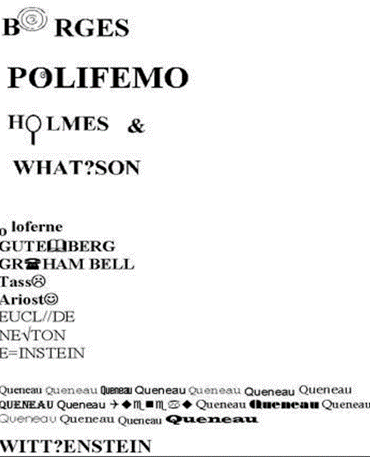
The illustrations show examples when Eco used graphons to create a language game. In this case, Eco uses the name of a certain character and uses a graphon to indicate its most characteristic characteristics. Let 's list these graphons: ? In place of the letter “O” in “Borges” there are concentric circles designed to convey Borges' penchant for creating riddles; ? In the first “O” in “Polifemo” the image of the eye is inscribed, in the second “O” it is not inscribed, which hints at the one—eyed character;
? The vertical line under the ”O“ in ”Holmes" hints at the image of a magnifying glass, which reminds of the character's tendency to notice small details; ? The question mark divides the surname “Watson” into two parts, in addition, the letter “H” is written after the “W”, so we get the question word “What”, which is designed to remind the character's tendency to ask questions; ? The first “O” in “Oloferne” is separated from the rest of the word, located below the line and resembles a head rolled away from the body, refers to the corresponding myth; ? The letter ”M“ in ”Gutemberg" is replaced by a graphic symbol of the book and reminds of the main achievement of the character; ? The first “A” in “Graham Bell” does the same, replaced by the phone symbol; ? The final “O” in “Tasso” and “Ariosto” are replaced with emoticons reflecting the attitude to the life of these characters; ? The letter “I” in “Euclide” is replaced by two signs “/”, thus, two disjoint parallel lines are incorporated into the name of this character, which can be considered a reference to one of the postulates of Euclidean geometry; ? The “W” in “Newton” is replaced by the square root sign, which reminds us of Newton's interest in extracting roots and his approximation method; ? The “N” in “Einstein” is replaced by the sign “equals”, thus, the graphic image of the surname reminds of the main achievement of the scientist: the equation linking the rest energy and mass; ? The name “Keno” is written in a row in several different headsets, which reminds us of his treatise “Exercises de style”; ? Instead of ”G“, a question mark is incorporated into ”Wittgenstein" again, which reminds us of hermeneutical insolubility. The second group of examples is somewhat more metaphysical in nature, although it remains, as always, with U. Eco, ironic (Figure 4). Figure 4 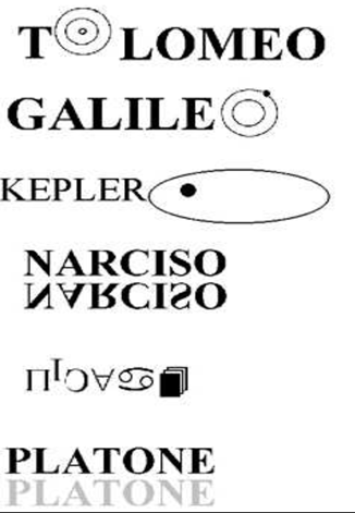
Let's move on to the interpretation of graphons in the second group of examples. ? The first “O” in “Tolomeo" is replaced by concentric circles resembling a geocentric model of the structure of the Universe; ? “The ”O“ in ”Galileo" is also replaced by concentric circles, while the outer circle has a small round thickening, which reminds of the heliocentric model of the Universe; ? The “O” in “Keplero” is replaced by an oval, which reminds of the elliptical trajectory of the planets; ? The name “Narcisso” is mirrored horizontally, which refers to the ancient Greek myth; ? The spelling of the surname “Picasso” is performed in a wide variety of graphic systems: “P” in Greek, “i” in Latin, “c” is mirrored vertically, “a” is written with a mathematical symbol denoting “any”, “ss” is written with the astrological symbol of pisces, “o” is denoted by overlapping triangles (an attempt to depict cubism by graphic means of language);
? The name "Platone” is written twice, the second time is paler, which reminds us of the myth of the cave. So, we have considered two groups of graphic tools for creating an individual style of Umberto Eco. As the above analysis has shown, these two groups serve different purposes. If phonetic and graphic means fulfill the goals prescribed to them by the design of the artwork (stylization, speech characterization of the character, etc.), then visual means (graphons) are a thing in themselves, i.e. their creation is an end in itself. In the case of phonetic-graphic means, Eco demonstrates to us his deep knowledge of paleography, and also seeks to give authenticity to the version of the Piedmontese language constructed by him. Visual means are designed to demonstrate ingenuity, a penchant for language play, as well as irony. They logically continue a number of postmodern techniques that Eco uses in his texts.
References
1. Baudouin-de-Courtenay, I.A. (2012). On the relation of Russian writing to the Russian language. Moscow, Librocomp.
2. Arnold, I.V. (2002). Stylistics. Modern English: Textbook for universities. Moscow, Flint: Nauka.
3. Kulkina, V. M. (2012). Mercer S. Truth and fiction in Umberto Eco's novel "Baudolino". Mercer S. truth and lies in Umberto Eco'S Baudolino [Electronic discourse]. Philosophy and literature. Baltimore: Johns Hopkins univ. Press, 2011. Issue 35(1), 16-31. Social and Humanitarian Sciences. Domestic and foreign literature. Ser. 7. Literary studies: An abstract journal, 3, 16-31. Retrieved from: https://cyberleninka.ru/article/n/2012-03-033-merser-s-pravda-i-vymysel-v-romane-umberto-eko-baudolino-mercer-s-truth-and-lies-in-umberto-ecos-baudolino-philosophy-and-literature
4. Eco, U. (2000). Baudolino. Bompiani, Milan.
5. Skvortsov, L.I. (2010). Culture of Russian speech. Dictionary-reference [Electronic resource]. Moscow. Retrieved from https://academia-moscow.ru/ftp_share/_books/fragments/fragment_17339.pdf
6. Tsygankova, A. A. (2023). Mechanical games in Texas / / Russian Linguistic Bulletin. №4 6. (40). Retrieved from https://rulb.org/archive/4-40-2023-april/10.18454/RULB.2023.40.30 doi:10.18454/RULB.2023.40.30
Peer Review
Peer reviewers' evaluations remain confidential and are not disclosed to the public. Only external reviews, authorized for publication by the article's author(s), are made public. Typically, these final reviews are conducted after the manuscript's revision. Adhering to our double-blind review policy, the reviewer's identity is kept confidential.
The list of publisher reviewers can be found here.
The article submitted for consideration "Graphic and visual means of creating an individual author's style (based on the texts of Umberto Eco)", proposed for publication in the journal "Litera", is undoubtedly relevant, due to the author's reference to the texts created by Umberto Eco. It should be noted that so far these texts have not been analyzed from the point of view of his individual author's style. In addition, the work makes a definite contribution to the development of both the general theory of linguistics and the private one. This article discusses the graphic means of creating an individual author's style by Umberto Eco. The article is groundbreaking, one of the first in Russian linguistics devoted to the study of such topics in the 21st century. It should be noted that extralinguistic, graphic means, as well as typological variation of the font is a rather promising area of research, the foundations of which were laid back in the works of I. V. Arnold in the line of "decoding stylistics". The article presents a research methodology, the choice of which is quite adequate to the goals and objectives of the work. The author turns, among other things, to various methods to confirm the hypothesis put forward. The article uses general linguistic methods of observation and description, as well as methods of discursive and cognitive analysis, semiotic methods and methods of language modeling. Unfortunately, the author does not specify the amount of practical material for conducting the study, as well as the methodology and principles of its selection. The positive thing is the presentation of a large amount of illustrative material in the article, confirming the judgments put forward by the author. This work was done professionally, in compliance with the basic canons of scientific research. The research was carried out in line with modern scientific approaches, the work consists of an introduction containing the formulation of the problem, the main part, traditionally beginning with a review of theoretical sources and scientific directions, a research and final one, which presents the conclusions obtained by the author. It should be noted that the introductory part provides too little overview of the development of problems in science. It should be noted that the conclusion requires strengthening, it does not fully reflect the tasks set by the author and does not contain prospects for further research in line with the stated issues. The bibliography of the article contains 6 sources, among which theoretical works are presented exclusively in Russian. We believe that referring to the works of foreign researchers on the stated issues would undoubtedly enrich the work. Unfortunately, the article does not contain references to the fundamental works of Russian researchers, such as monographs, PhD and doctoral dissertations. Technically, when making a bibliographic list, the generally accepted requirements of GOST are violated, namely, non-compliance with the alphabetical principle of registration of sources. In general, it should be noted that the article is written in a simple, understandable language for the reader. However, in some cases there are typos, for example, "individual author's style". The comments made are not significant and do not affect the overall positive impression of the reviewed work. The work is innovative, representing the author's vision of solving the issue under consideration and may have a logical continuation in further research. The results of the work can be used in the course of teaching at specialized faculties. The article will undoubtedly be useful to a wide range of people, philologists, undergraduates and graduate students of specialized universities. The article "Graphic and visual means of creating an individual author's style (based on the texts of Umberto Eco)" can be recommended for publication in a scientific journal.
Link to this article
You can simply select and copy link from below text field.
|
|